The Laffer Curve Graph Explained
Grades 11-12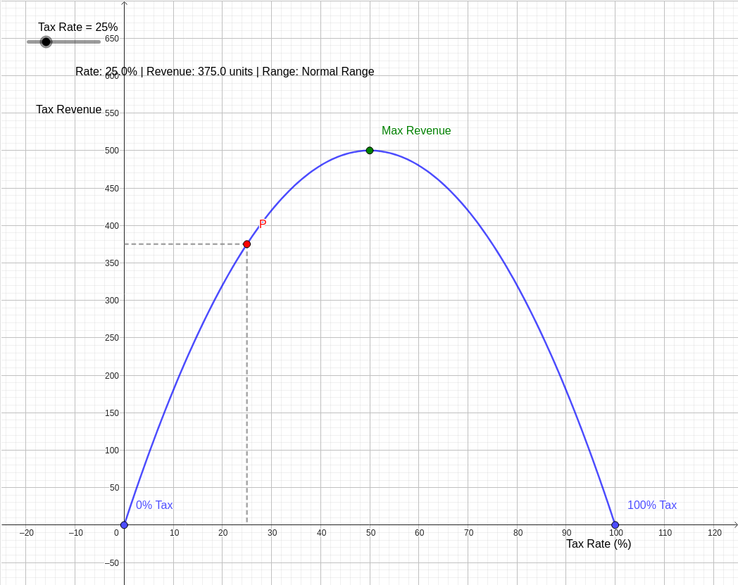
Question: Graphing the Laffer curve
The Laffer Curve is a fundamental concept in supply-side economics that illustrates the relationship between tax rates and the total amount of tax revenue collected by a government. It suggests that there is an optimal tax rate that maximizes revenue, beyond which increasing taxes actually leads to a decrease in total collections.
Conceptual Foundation
The curve is built on two logical certainties at its extremes:
- 0% Tax Rate: If the tax rate is zero, the government collects no revenue, regardless of the size of the tax base.
- 100% Tax Rate: Theoretically, if the tax rate is 100%, the government also collects no revenue. This is because rational individuals have no incentive to work, invest, or produce if the entirety of their earnings is confiscated.
Between these two points, as the tax rate increases from 0%, revenue initially rises. However, the higher the rate, the more it discourages the activity being taxed (the tax base). Eventually, the negative effect of the shrinking tax base outweighs the positive effect of the higher rate.
Mathematical Representation
We can model this relationship using a downward-opening parabola. If
represents Revenue and
represents the Tax Rate (as a percentage), a simplified model is:
In this equation:
- The roots occur at and , matching our logical extremes.
- The vertex (peak) of the parabola represents the Revenue-Maximizing Tax Rate.
Key Features of the Diagram
- The Blue Curve: This represents the Laffer Curve. It starts at the origin (0% Tax) and returns to the horizontal axis at 100% Tax.
- The Green Point (Peak): This identifies the specific tax rate where revenue is at its absolute maximum.
- The Red Point (Current State): You can use the slider to adjust the tax rate and see how it affects revenue.
- Normal Range (Left Side): In this region (typically between 0% and the peak), increasing the tax rate leads to higher revenue.
- Prohibitive Range (Right Side): In this region (beyond the peak), the tax burden is so high that it stifles economic activity. Here, the counter-intuitive "Laffer Effect" occurs: cutting tax rates can actually increase total tax revenue by significantly expanding the tax base.
Moving the slider will demonstrate how a government on the right side of the curve could potentially lower taxes and increase its budget simultaneously, whereas a government on the left side must raise taxes to increase revenue.
引导:观察当税率(Tax Rate)超过顶点(Max Revenue)时,虚线投影显示的收入如何开始下降。